Properties: Leader
The Leader properties page manage object properties for the selected Leaders.
Leader properties page is divided in the following sections or dropdowns:
Text
Style
The used annotation style.
Style menu
Lists the annotation styles available in the model. If an annotation has any settings in its properties different from its style, a menu behind the style name appears.
Remove overrides: Resets all the changed settings to the style defaults.
Update (Style) to match: Resets all the changed settings to the style defaults.
Save as new style: Uses the settings in the properties to create a new style.
Edit Style...: Edits the Annotations style used by the selected annotation object.
Height
The text height.
Mask
Surrounds text with an opaque color.
- None: Turn off mask. Use the same scale for X and Y.
- Background: Sets the mask color to the viewport background color.
- Solid Color: Selects the mask color using the Select Color dialog box.
Mask Color
When Mask is set to Solid Color, click to change the color.
Mask margins
The width of the blank area around the text.
Model space scale
The display size is a product of the component's size (like arrow size or text height) and the Model space scale value.
Normally this is the inverse of the print scale. The text height, extension line extension, extension line offset distance, and arrow length are multiplied by this number.
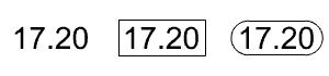
Frame around text
Displays a shape enclosing the dimension text to No frame (left), Rectangular frame (middle), or Capsule frame (right). The Mask margins setting controls the distance between the text and rectangle.
Font
The text appearance.
Click to open the drop-down list, and type the initial letter of a font to find the font quickly.
- Text aligment Text position within the containing box.
- text styles
Text style options.
Edit Box
- Angle brackets: The angle brackets represent the dimension value. You can type additional text before or after the angle brackets, or you can eliminate the angle brackets.
To type multi-line text, press and hold Alt and press Enter. - Dimension display: The current dimension value.
Edit Box
The text displays in the leader.
Edit style
Edits the Annotations style used by the selected annotation object.
Match
Select an annotation to apply its properties to the current annotation.
Add curve point
Allows placing an additional edit point to the leader curve.
More properties
Arrowhead
Select the shape of the arrowhead at each end.
- User arrow: Uses a previously defined block as an arrowhead.(This option is not available when no blocks exist in the model.)
To create a block to represent the arrowhead draw the arrow elements and create a block from the geometry.
The base point of the arrowhead block determines how the arrowhead is placed on the end of a dimension line or a leader.
If you want the tip of the arrowhead to be accurately placed at a location, be sure to place the base point of the arrowhead block at the tip. - No arrow: No arrow is drawn.
Arrow size
The length of the arrowhead from tip to tail.
Curve type
Sets the type of curve used by the leader.
- None: Only the arrowhead and text are drawn.
- Polyline: A segmented polyline is drawn.
- Spline: A control point curve is used as the leader line.
Text alignment
- Horizontal
The text aligns to the construction plane x-axis. - Aligned
The text is aligned to the leader segment.
 Landing
Adds a short horizontal line between the leader line and the text.